Whether you require an information pack, brochure, flyer or report, a great page layout will help you to communicate your message clearly and engage your reader.
There is more to page layout design than running in the text and adding a photo! Page layout involves placing, arranging and formatting the different elements on a page, including, but not limited to, images and text. The design should be aesthetically pleasing whilst also allowing the reader to navigate the page successfully to understand the key messages.
We let you into our top 5 secrets of how we design a great looking page;
The focal point of the page
There should be just one focal point on any page whether your document is one page like a flyer or is made up of many pages. We love being provided with a selection of high resolution photos because it means we can choose which one works best. The focal point helps to draw the viewer in gives them a sense of what the page is about immediately.
If good quality photos aren’t available sometimes the same effect can be achieved with larger headings or branding elements to create some visual interest.
Having a hierarchy in your design
A clear hierarchy on your page means that the navigation for the reader is easy. By showing the importance of different page elements it helps your page to make sense. For instance, a headline should always be larger than the body text and body text always larger than an image caption. Once the most important element is placed, the rest of the page can be designed around it.
Using a grid to design your page
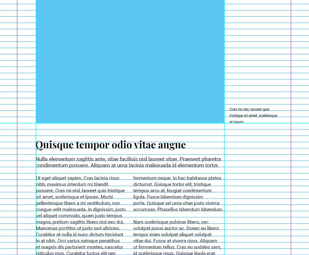
To make sure your page looks balanced we design it using a grid system which is specific to your project. The grid ensures the different elements are lined up evenly and creates order. It also makes sure the text and images are a consistent distance from the edge and text runs neatly around images. We also place text on a baseline grid to keep a consistent space between lines and make sure lines are level across pages.
Leave some white space
White space, also known as ‘negative space’, is the empty space around the elements on a page. It could also be the space between the lines in a paragraph or between paragraphs. The white space helps to create balance in a design and leads the eye around the page. If a page is overcrowded, without white space, all the elements become unstructured and difficult to read.
Some businesses may see the white space as empty space especially if they are paying for an advert in a magazine and want to get as much information across as possible. However, the white space is very valuable in getting your message across.
Formatting the text
Once the design is nearly there we take a good look at the formatting of the text within a document. We make sure there aren’t any hyphenated words and then ensure any widows or orphans within the document are banished. Widows and orphans are terms used to describe stray words at the beginning or end of a paragraph that make the text look unbalanced and messy. They can create a visual interruption that breaks the readers flow unnecessarily. Also, by playing around with image sizes we try to make sure that all text for each section is kept together rather than flowing onto the next page.
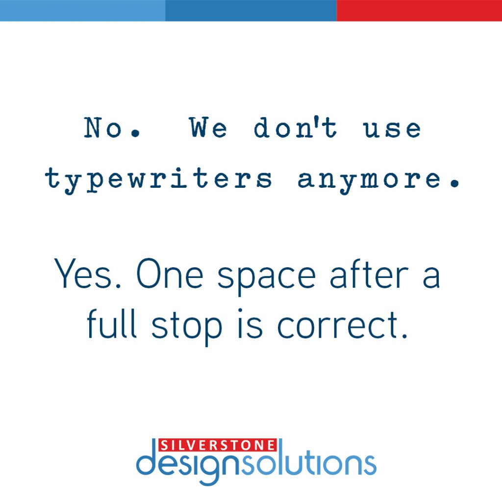
One of our very last checks in a document is checking for any double-spaces (or 3 or 4) after a full stop. There should only be one space after a full stop. The double space was commonplace in English books for a long time including in the Bible. With the wide use of typewriters, double spaces continued to be used until the late 20th century. A single space became the norm with the introduction of mass published books and personal computers when a double space just made the text look uneven. In 2020, Microsoft Word started to officially categorised a double-space after a full stop as a mistake.
We’ve designed many different types of pages over the last 15 years for a variety of items from 300-page annuals to 10-page information packs and across a range of industries. What they all have in common is that as well as being aesthetically pleasing they all have to engage your reader and communicate your message clearly.
If you’re looking for a graphic designer to create professional page layouts for your next project, please get in touch rosanne@silverstonedesignsolutions.com


